Bay Area–Ready Exterior Siding Color Palette Guide
Designed specifically for East Bay and San Francisco Bay Area homes, this guide uses James Hardie® ColorPlus® Technology colors that perform well in coastal fog, strong sun exposure, and temperature swings—while protecting long-term curb appeal and resale value. James Hardie siding is especially well suited for Bay Area conditions thanks to its durability, fade resistance, and architectural versatility.
With 28 years of experience, the Custom Exteriors team brings a depth of knowledge that goes far beyond product selection. Since 1997, we’ve helped thousands of Bay Area homeowners confidently choose exterior color combinations that complement their home’s architecture, perform well in local climate conditions, and stand the test of time. Our design guidance is rooted in real-world experience—understanding how colors look in different light, how they age in fog and sun, and how they impact long-term curb appeal and resale value. When you work with Custom Exteriors, you’re not just picking colors from a chart—you’re partnering with a team that knows how to bring those colors to life beautifully and responsibly for your home.
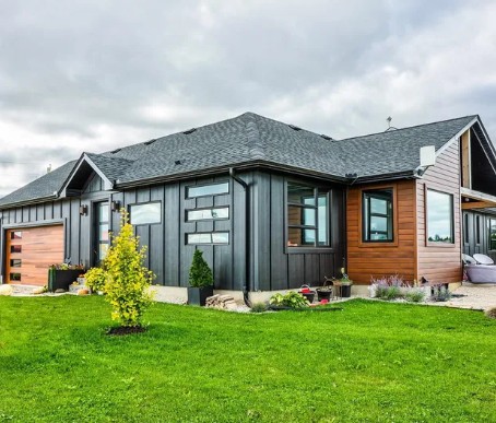
Timeless Bay Area Neutrals (Best Overall Choice)
This palette is especially well suited for Craftsman, Ranch, Traditional, and Transitional homes, with James Hardie® colors such as Monterey Taupe, Cobble Stone, Light Mist, and Pearl Gray offering a balanced, timeless look. These shades perform exceptionally well in the Bay Area by minimizing the appearance of fog residue and dust, reflecting heat more effectively than darker colors, and blending naturally into East Bay neighborhoods and HOA environments.
Their understated elegance also supports long-term curb appeal and resale value. For a clean, soft contrast, these siding colors pair beautifully with Arctic White or Navajo Beige trim.
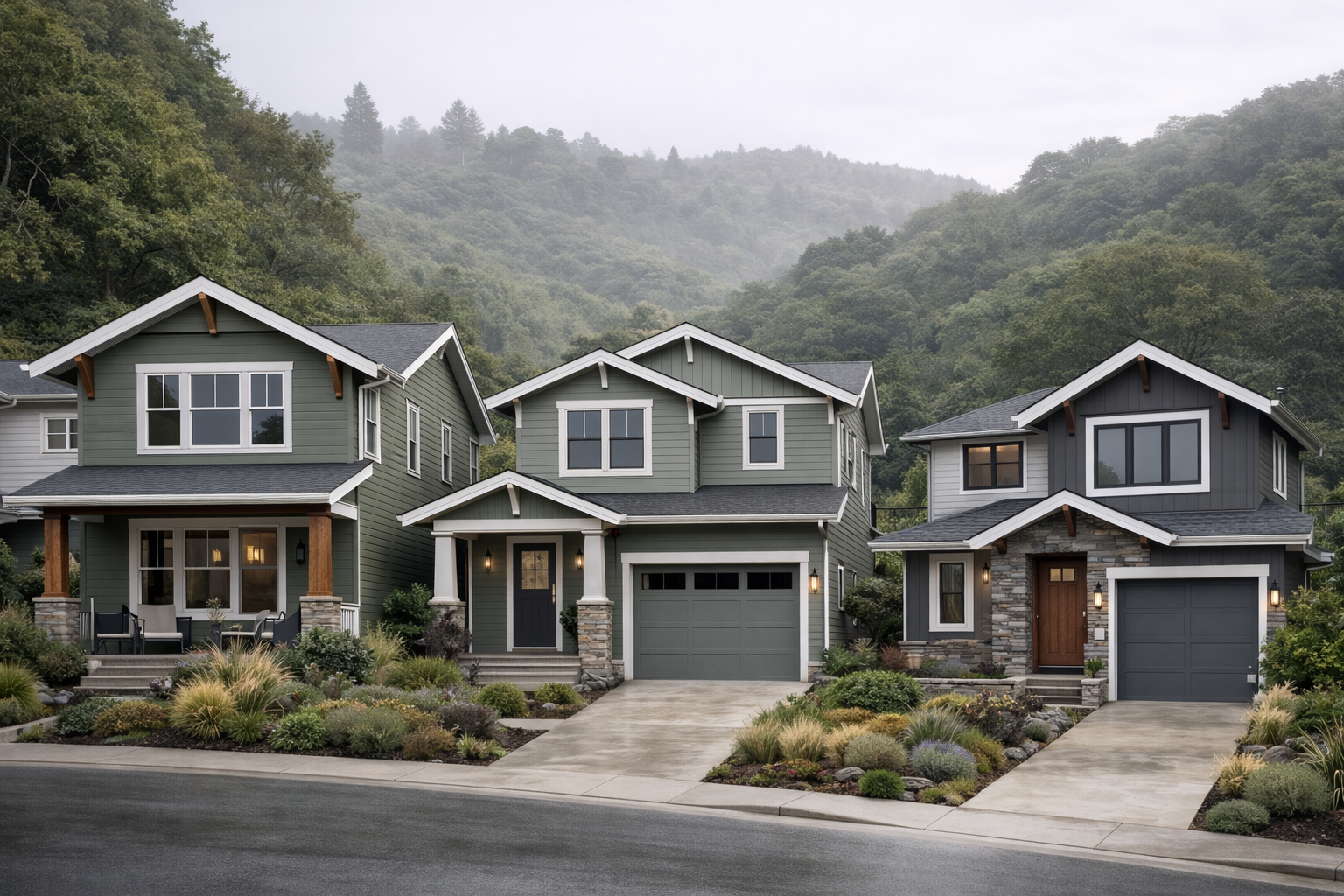
Earth-Inspired Greens (Bay Area Favorite)
This color group is an excellent fit for Craftsman, hillside homes, Modern Farmhouse designs, and custom builds, featuring James Hardie® colors such as Mountain Sage, Aged Pewter, and Night Gray, which carries a subtle green-gray undertone. These shades work especially well in the local environment by complementing surrounding hills, trees, and natural landscaping while delivering an upscale, regionally appropriate look.
They offer long-term appeal without feeling trendy and pair beautifully with wood or stone accents commonly used in Bay Area architecture. To maintain a cohesive and lasting exterior, it’s best to avoid bright or blue-based greens that fall outside the ColorPlus® palette.
Soft Coastal & Fog-Friendly Tones
This color palette is ideal for fog-influenced areas, coastal Bay communities, and Peninsula homes, featuring James Hardie® colors such as Evening Blue, Boothbay Blue, and Gray Slate. These shades perform exceptionally well in fog and filtered light, maintaining a clean, intentional appearance without overpowering the home’s façade.
They introduce subtle color that enhances curb appeal while remaining refined and timeless, and they pair especially well with modern window frames and simple architectural details. For a crisp, balanced finish, these siding colors are best complemented by Arctic White or Pearl Gray trim.
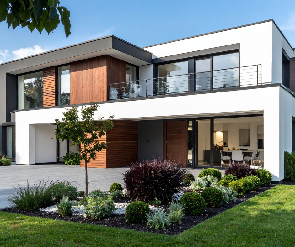
Modern Charcoals (Use Strategically)
This color group is best suited for Modern, Contemporary, and Mid-Century Modern homes, with James Hardie® colors such as Iron Gray, Night Gray, and Gray Slate delivering a bold, architectural look. In the Bay Area, it’s important to consider that darker colors absorb more heat, making proper installation critical to long-term performance.
These deeper tones are most effective when used selectively—such as on accents, second stories, or partial elevations—where they create strong visual contrast without overwhelming the façade. For best results, dark siding colors should always be paired with a properly designed rainscreen system, adequate wall ventilation, and light-colored trim or accents to balance the overall appearance and reduce visual heaviness.
Wood-Look Accents (Without the Maintenance)
This approach is best suited for gables, entries, and accent walls, using James Hardie® colors such as Timber Bark, Rich Espresso, Chestnut Brown (where regionally available), and Cedarmill® textures in lighter neutral tones. Bay Area homeowners appreciate this look for the warmth and architectural character it adds without the drawbacks of natural wood.
These wood-inspired tones deliver the visual richness of real wood while avoiding issues like rot, warping, and heavy maintenance, and they pair seamlessly with smooth or lap siding profiles. For the most balanced and timeless result, wood-look colors are best used as accents rather than full-home façades.
18 Months ZERO Payments + ZERO Interest
OR
4.99% Financing on Approved Credit
lEARN mORE →James Hardie Colors to Use With Caution in the Bay Area
Bright white siding should be used with caution in the Bay Area, as fog, moisture, and airborne grime can cause it to show dirt and discoloration much more quickly than softer neutral tones. This can lead to more frequent cleaning or repainting to maintain a fresh appearance, increasing long-term maintenance costs.
Pure black tones are generally not recommended for Bay Area homes, as they absorb significant heat, accelerate fading. These tones can also appear overly harsh and can detract from architectural details rather than enhance them.
Ultra-high-contrast color blocking without thoughtful architectural balance can make a home’s exterior feel visually disjointed and dated over time. In the Bay This approach often overwhelms the home’s natural lines and reduces timeless look that supports long-term curb appeal.
Highly saturated, trendy colors should be avoided when choosing siding in the East Bay, as intense hues tend to fade unevenly under strong sun exposure and can quickly fall out of favor. These colors often clash with surrounding neighborhoods and natural landscapes.
Convenient Financing Options
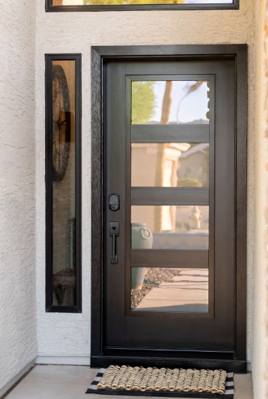
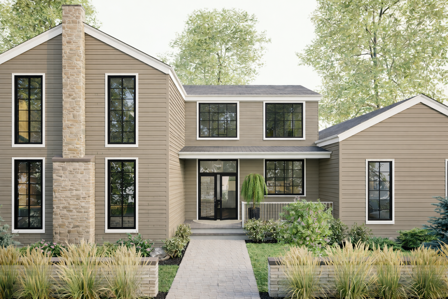
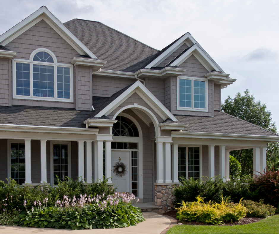
Inspiration Gallery

-1920.webp)


.webp)


-1920.webp)